Instagram has become the cornerstone of social media engagement, continuously evolving to keep users intrigued. Recently, the platform made headlines with its decision to move Story highlight bubbles from their prominent position above the profile grid into a dedicated section, warranting discussion about the implications and motivations behind this change. This article explores the new updates to Instagram’s profile display and analyzes the potential consequences for user interaction and content visibility.
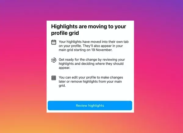
The update rolled out by Instagram signifies a logical shift in how Story highlights are presented to users. Instead of the circular “pogs” placed above the profile grid—an arrangement that has provided a quick glimpse into a user’s past stories—these highlights will now reside in a separate section marked by a heart icon, offering a more organized and tidy aesthetic for profiles. This alteration is not merely for cosmetic enhancement; it aims to declutter the profile space, allowing users to spotlight key information more coherently.
Social media expert Lindsey Gamble highlighted the notification users received about this evolution, indicating this change is set to appear in the coming week. What remains uncertain is how these highlights will be managed within the main grid—whether they will be arranged chronologically or perhaps based on user engagement metrics. However, the emphasis appears to be on ensuring that the most crucial content gets priority visibility.
Adam Mosseri, the head of Instagram, has elaborated on this strategic move by saying, “We’re trying to figure out a way to improve the profile and get more of the content above the fold, and simplify it.” His insight reveals the underlying intent: to enhance user experience while managing the aesthetic of profiles. While users will still have control over how they present their highlights, the change seeks to eliminate the chaotic visual experience that could accompany the previously circular display.
His reference to “pogs”—a term that may seem trivial but conveys significant history in the context of online design—indicates how Instagram considers even cultural nuances in its interface design. By re-engineering the placement of Story highlights, Instagram seems to promote user engagement in a curated manner rather than overwhelming users with a plethora of options.
While the update is designed to simplify the visual experience for users, it may also have unintended consequences on how frequently individuals interact with Story highlights. The previous positioning might have encouraged users to tap into highlights more readily, given their visibility right at the top of a profile. Transitioning to a separate tab means that highlights will likely require more intentionality for users to access, which could lead to decreased viewing rates.
Yet, this brings forth a question about the value of Story highlights. Initially introduced to provide a means of preserving ephemeral content, it’s apparent that Instagram is reassessing users’ interest in archival material. This indicates a potential shift in user behavior; if a majority of users gravitate away from tapping into past stories, it could signal a collective preference for immediacy over the archival.
The change in the display of Story highlights is a noteworthy step in Instagram’s ongoing strategy to refine user experience and content management. Social media platforms are perpetually experimenting to discern what captures and retains audience interest. As Instagram continues to navigate this landscape, the recent update could foreshadow additional features or modifications aimed at fostering more genuine, timely interactions.
Instagram’s decision to relocate Story highlights to a dedicated tab ultimately reflects a commitment to enhancing clarity and usability. As users adapt to this new layout, monitoring the effects on engagement and user behavior will be crucial. The evolution of social media platforms is a narrative of constant adaptation, and Instagram’s changes exemplify this ongoing pursuit of balancing aesthetics with functional interaction. Perhaps as the platform evolves, it will continue to adjust based on user feedback, fostering a more personalized experience tailored to contemporary usage patterns.


Leave a Reply